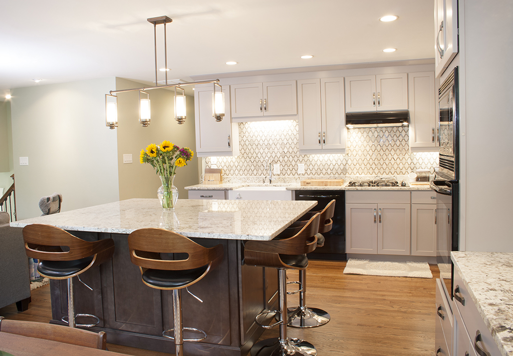
We transformed this house into a home. Before I get started with the design. Let me tell you about Henry and Courtney.
For many years Henry has been living alone in this house. It’s become his home. He’s an entrepreneur who’s started several companies in the technology market. He’s always worked from home and been comfortable with it.
He spends his money wisely, saving and supporting a child from his first marriage. Courtney is a recent graduate with extreme intellect and a calm sweet demeanor. She has clear direction with her goals and is well intentioned with her decisions.
Together they make an amazing couple who found each other later in life. After being relatively established in their careers.
Henry as I mentioned before has owned the home for many years. Courtney is entering a home with a past. A home, evolved into one formed around Henry and his lifestyle.
As you live in a home the home begins to form around you. It becomes part of your story. Part of who you are. When someone new enters, it can disrupt the flow. The home needs to react and sometimes that reaction creates challenges. The goal is to overcome those challenges.
They decided to share their lives. The home needed to become theirs. This is an interesting challenge. How do you adapt a home to accept someone new. How do you transition a home while maintaining the past? Transition his home into their home?
We were to create a home for a family. A new family.
As I go through the process below, note I have a sequence to my sketching. My process allows me to study the space for what it is and what it has the potential of becoming.
In the beginning, we set the goals for the project. We would make the home a space that spoke to both of them.
The second was to open the kitchen to the dining/living room and allow for more space. The enclosed kitchen would no longer work for a couple that enjoyed to cook. Not only do they cook for themselves but for guests. I was fortunate enough to share a meal with them as we worked through some of the design.
The space was to host friends. Henry and courtney are extraverts.
They enjoy hosting friends on a very casual level. It’s often that you find a friend over, chatting or watching tv. All casual and all on a very personal level. They’re now merging friends. They’re bringing two sets of friends together. They needed space to make that goal happen.
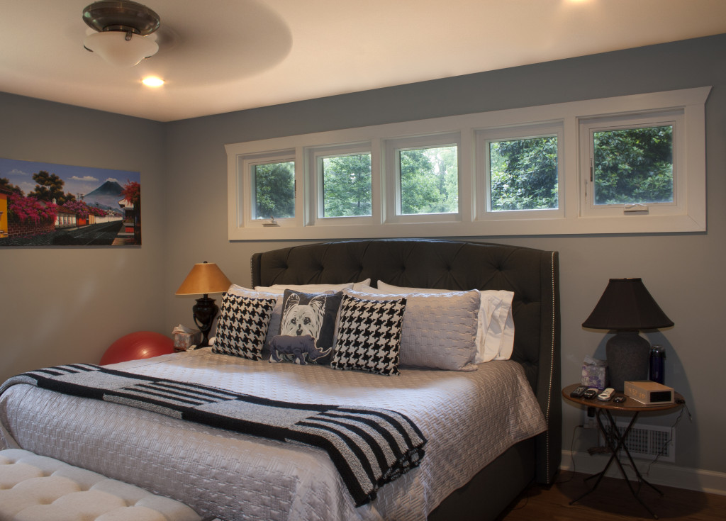
On a more private level, the master bedroom was too small. It was typical of older ranch style homes to have smaller bedrooms and tiny closets. They would need more space as a couple
Henry was living comfortable before but together was not working. The goal was to expand the bedroom, bath, and closets while using the space of an adjacent bedroom.
This eliminated the guest bathroom. We would be adding a powder room for the fequent house guests.
All these adjustments were to the main level of the home. There were things done in the basement related to finishes, but wall’s remained the same. So let’s look at the home.
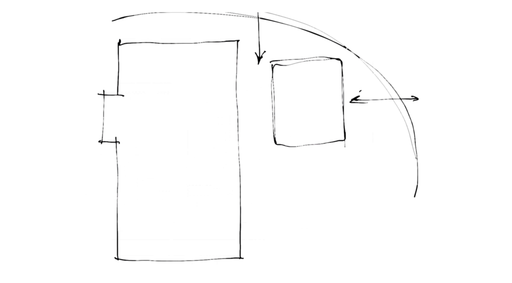
Much like the joining of two people Henry and Courtney lived on a corner property. The corner lot offers an abundance of activity and clear presence to the home.
It’s divided into three main sections. The garage towards the East. The main home located to the west and a connection element ties the two together. This connection is the main entry to the home.
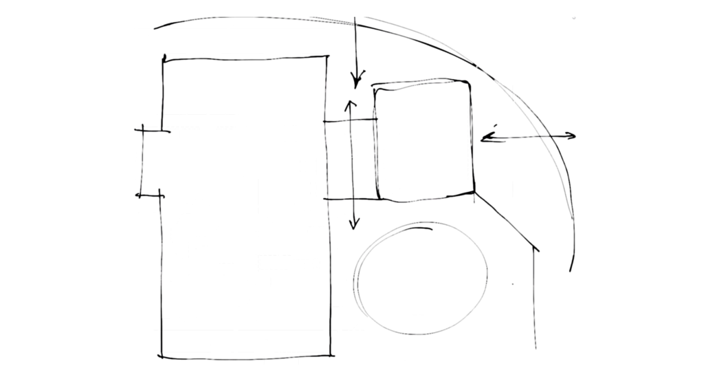
Passing through the connection takes you to the couple’s private patio area. You sink down several steps to the basement level. There you enjoy the privacy of having an enclosed courtyard outdoors.
This was working for them so far. They were satisfied with the entry and how the home flowed from interior to exterior. They were happy with the garage connection and the entry.
Even though they wanted to upgrade finishes in this area, it wouldn’t be an area of focus. This was saved for a later date.
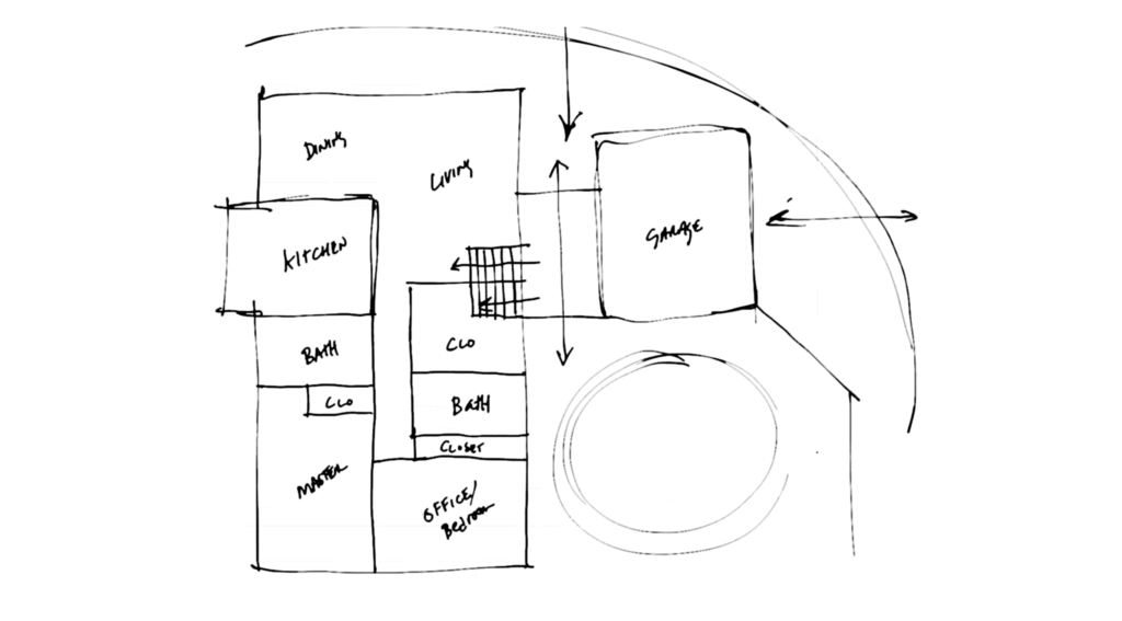
Now exploring the areas causing disruption. The kitchen was of great concern. Two people had a hard time being productive. Henry and Courtney were big cooks and enjoy to prepare meals together. They also like to host so a kitchen able to accommodate these two things was a must. The compartmentalized kitchen needed to unfold. It needed to open up to more areas of the home.
Travel back to the more private areas of the main level. We had two bathrooms. There was a large awkwardly located walk in closet next to the entry stair far from any bedroom. At the end of the hall was a small master bedroom and guest room. The closet’s of these two rooms were small and inadequate by todays standards.
The two of them are very conservative with the amount of things they have in the home. It’s not a cluttered space but the items they do need have to find a place. Larger closets would help to accommodate the need.
The bathrooms were small. One located off the master was rarely used. The configuration of space and fixtures made it uncomfortable. The other hall bathroom was serving the two of them. Henry was using the bath off the master for a few things and courtney was using the one across the hall.
This was less than ideal. They needed more space and more usable area in the master suite. We also needed a way to expand closet space.
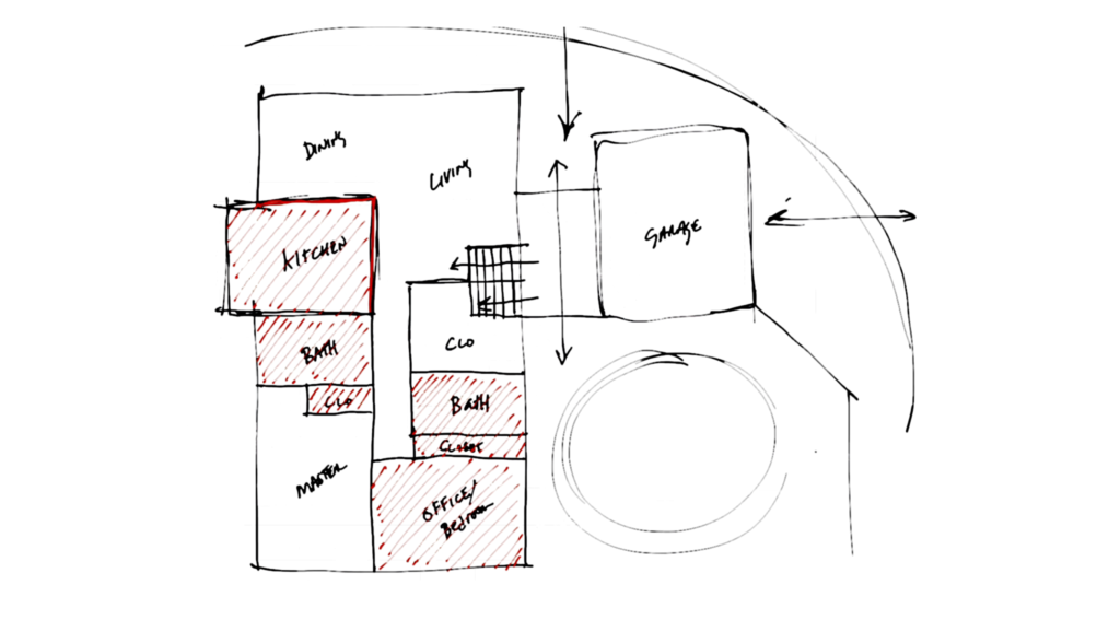
We looked at adjusting these main areas. This was the entire main floor.
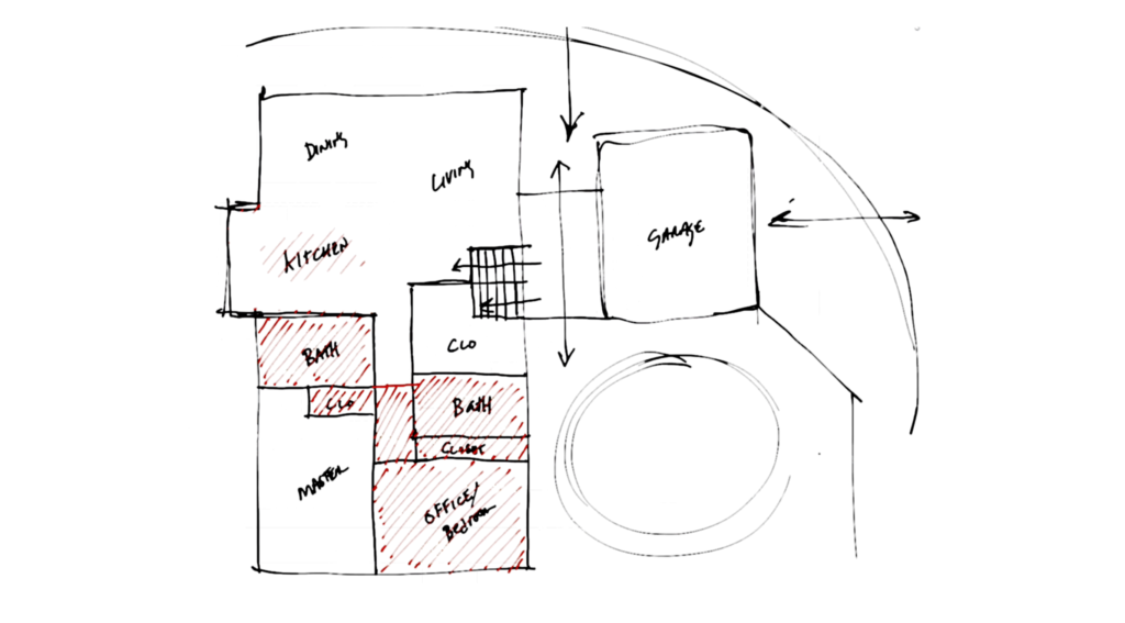
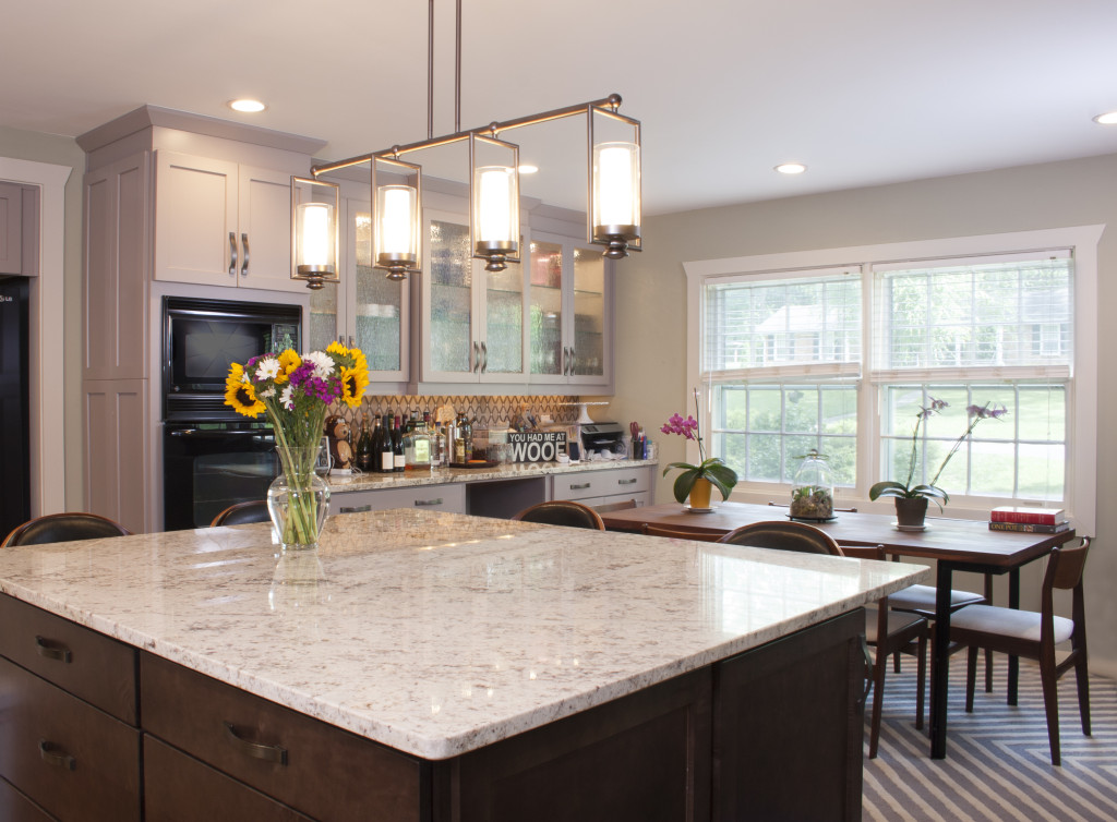
We started by removing the kitchen walls and cabinetry. This opened the space up to the adjacent dining and living rooms. The size increased and the area felt more comfortable once you enter the home and rise up to this level. The space was more inviting.
We studied the hall leading to the back bedroom to see if we could capture that space and repurpose it.
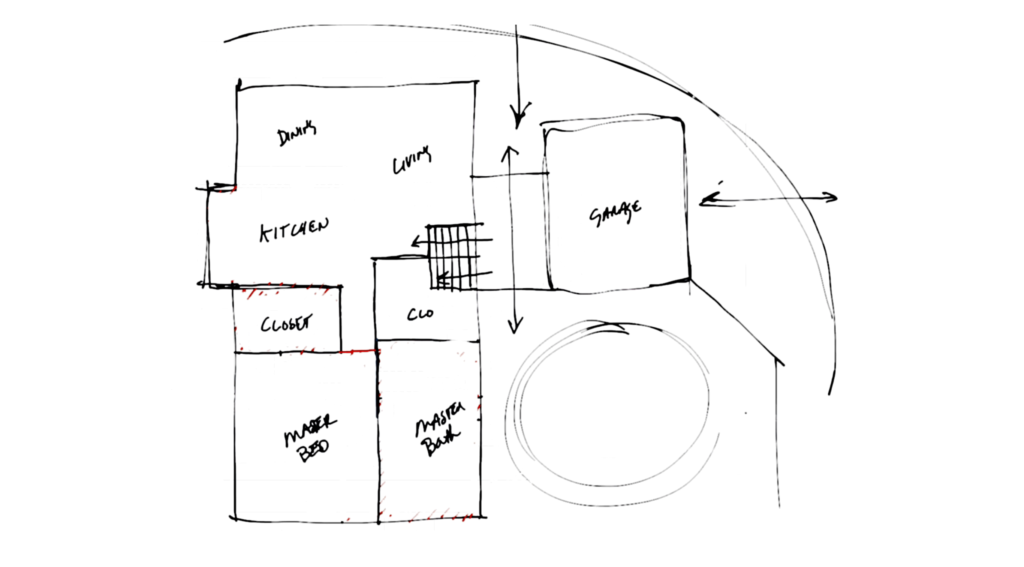
We decided to move the master bedroom wall to the other side of the hall and remove the interior wall. This gained us 42” more in the width of the master.
The existing bedroom and bath were then removed. This allowed for more flexibility with the design of the master bathroom.
The awkward closet, once located off the hall, was now conveniently located. The existing bathroom off the master located between the kitchen and master bedroom was removed. We decided to utilize the space for a large walk in closet off the master and a powder room off the hallway for guests.
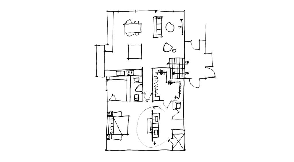
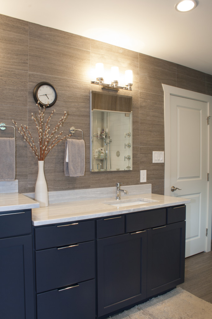
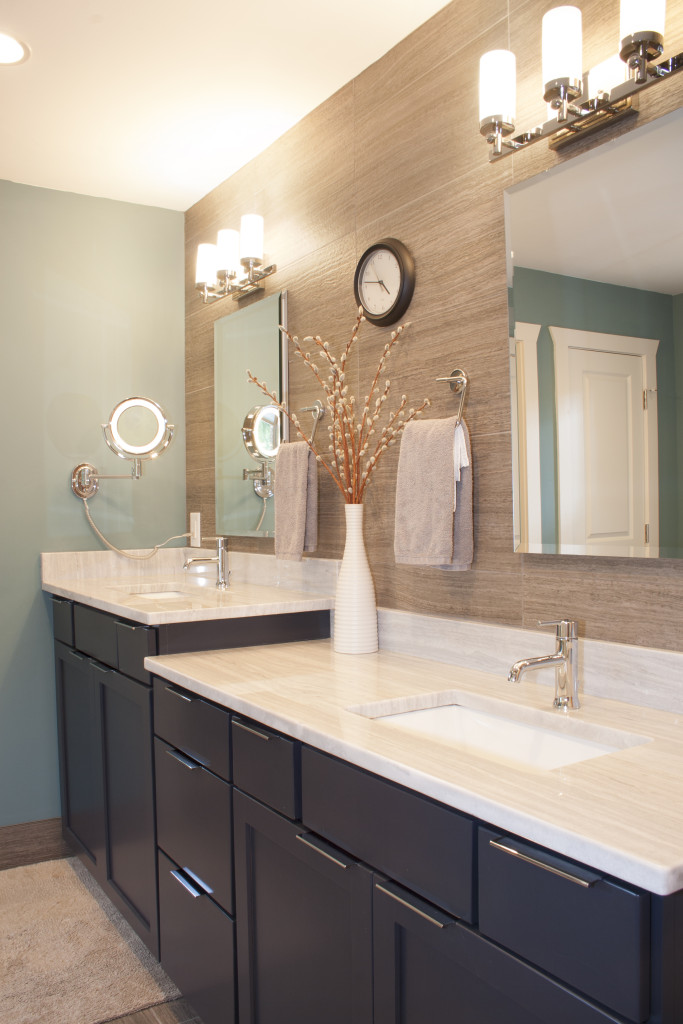
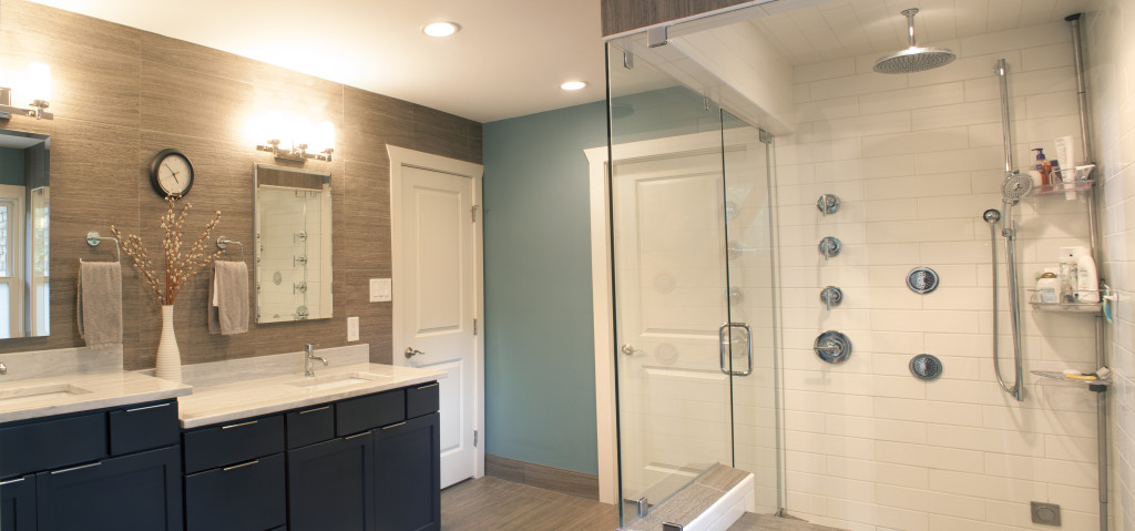
The main vanity wall of the master bathroom was on the back side of the room separation. There were two circulation paths created around the sides of the entertainment wall. Either side of the master had convenient access. It provided an interesting flow to the space.
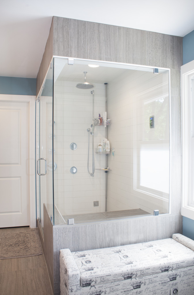
We located the toilet room and steam shower on the outside walls occupying the corners. There was an existing window located between the two providing some natural light into the room. The large master closet off the bathroom worked nicely. The door to the maser recessed into the hall to allow for the swing to be out of the way of the usable bedroom floor.
The powder room was able to work its way into the area just off the hall. The new walkin master bedroom closet would remain to be Henry’s. Courtney got the larger of the two off the bath.
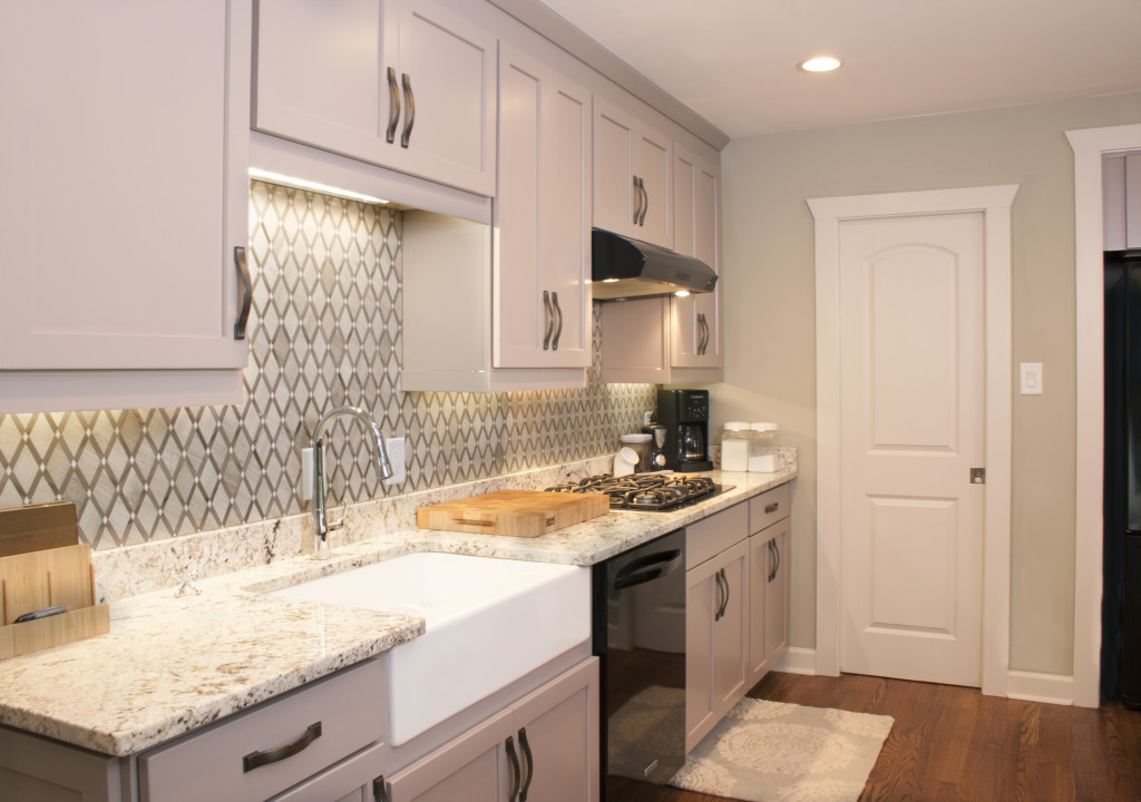
Back to the kitchen. After opening it up an island was added to the space. Cabinets along the side wall along with various kitchen layouts were explored. To minimize costs we kept the fixtures in their original locations. We would relocate the refrigerator off the demolished wall to the nook on the exterior wall.
There was a window here but it overlooked the neighbor’s house. It was too close for real comfort so they kept it closed most of the time. The refrigerator and soon to be pantry outweighed the benefit of the window.
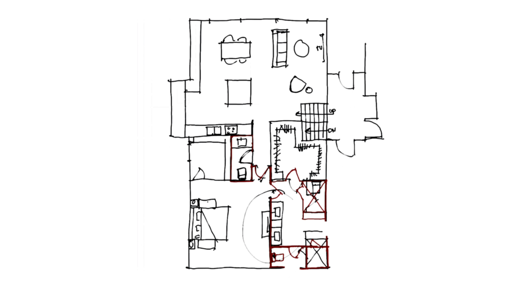
We decided to look at some alternatives in the master bathroom. The circulation was not as important to them in this space. I looked at relocating the toilet room and the shower to gain more natural light into the space.
Relocating the toilet allowed for a linen closet. The distance between the shower and toilet room increased allowing for a larger window more natural light.
We also placed a new window into the toilet room. The pocket doors changed to one swing door. It was able to just clear the closet door.
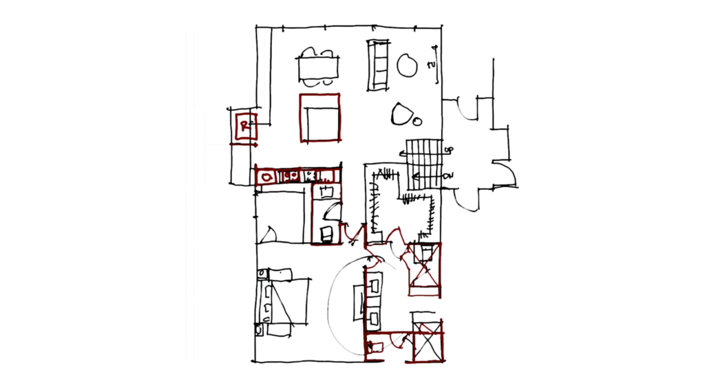
The refrigerator placement was explored and the island increased. A large island is always valuable when entertaining guest. It also offered Henry the flex space to work from the counter if needed.
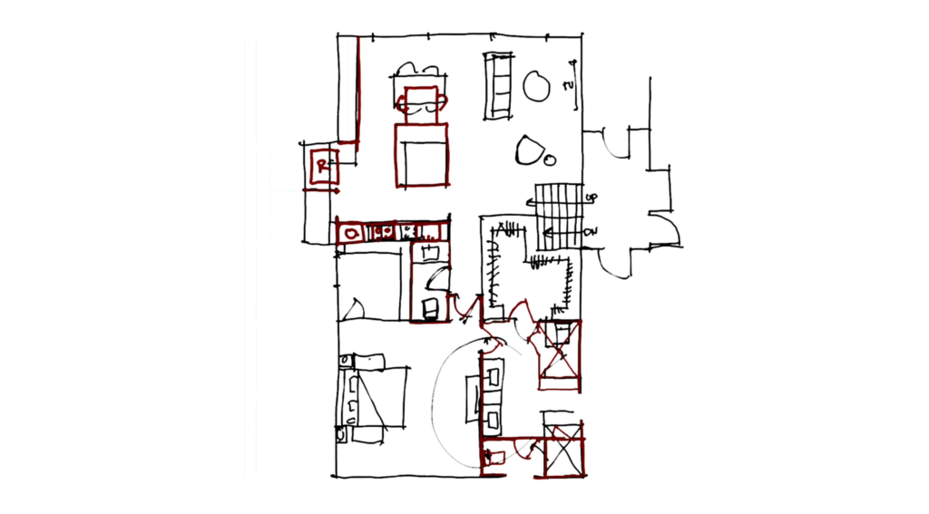
With the increased island we explored several creative ways of integrating a table. This idea was ultimately discarded.
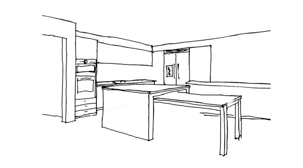
We began to mass out the space to determine the portions of the room. It moved through several levels and stages of study. Each pass providing more detail information.
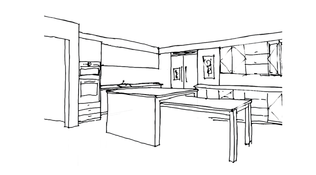
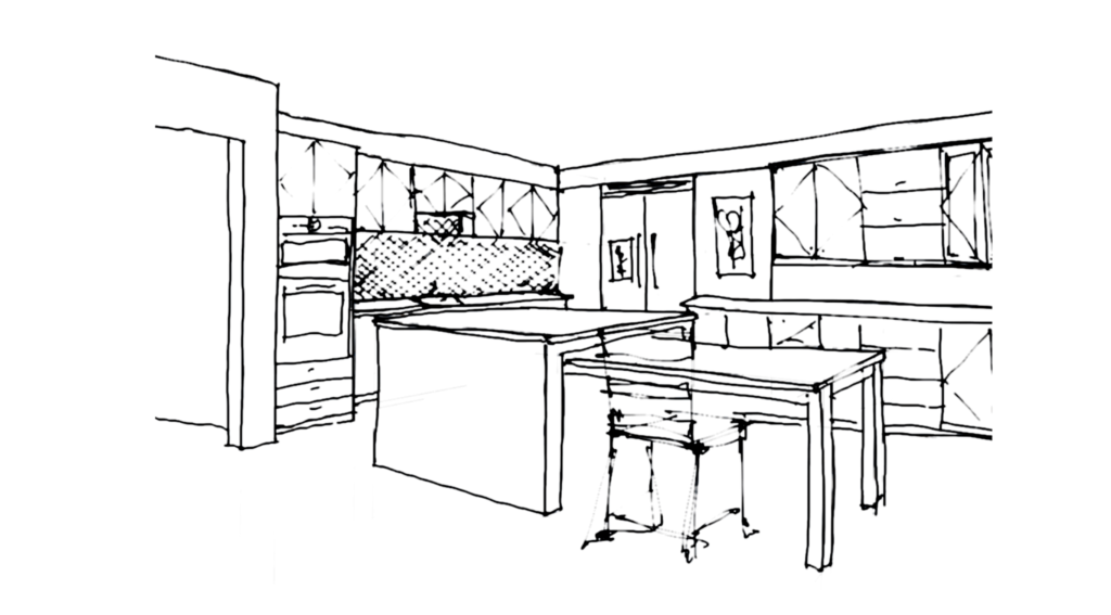
Similar studies were done for the master bathroom as well. It’s important to study spaces in three dimensions. You begin to understand the proportions and character of the design.
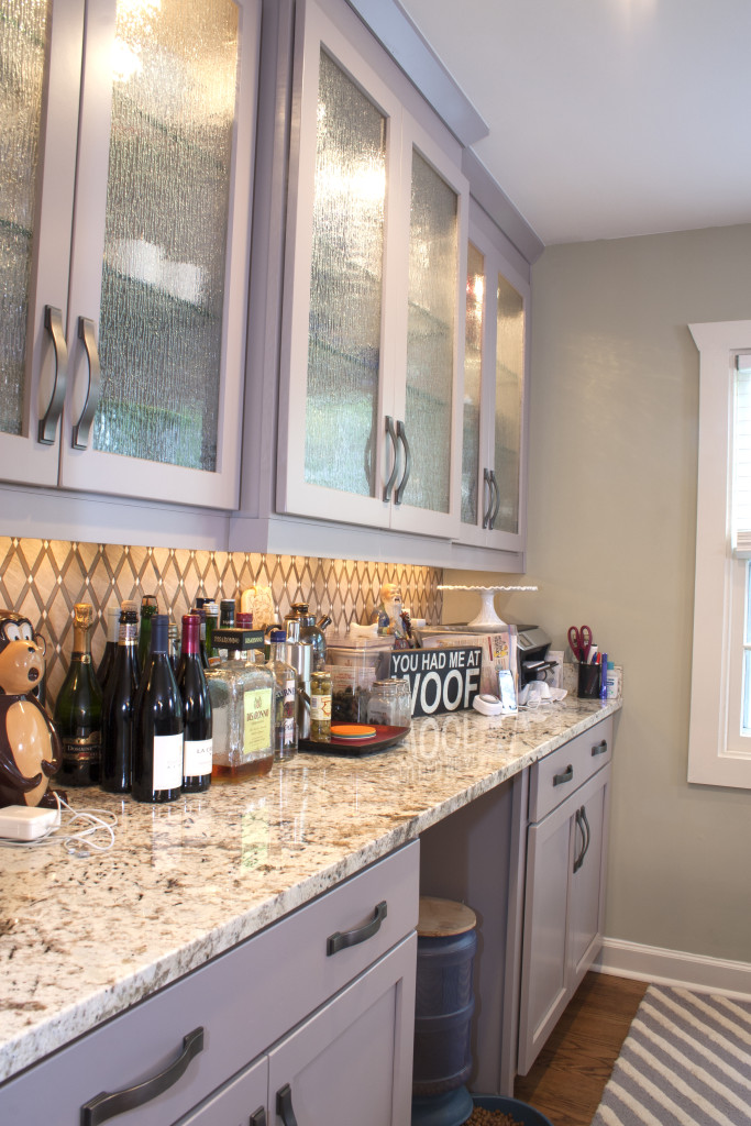
When we started to study this kitchen we discussed the amount of bar. They didn’t need as much bar counter. We were able to slide the refrigerator over. This allowed a small pantry to be included in the corner by eliminating some cabinetry. This added a nice space for food storage.
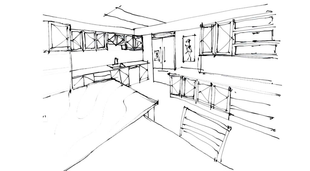
The end result was a beautiful space that spoke to both of them. A space they could call home. A space they customized as a couple. It was a pleasure to work with them and transition their home. A home once Henry’s into a home uniquely their own.
